Add the Display Name to the comment header
Title:
Add the Display Name to the comment header
Area:
comment pages
Summary:
There's been a lot of debate over using the username vs. the display name on icons' alt-text+hover-over tool-tip and the accessibility/usability issues that come with changing it from username to display name. This solution is a good compromise on the issue, since it puts the display name somewhere accessible to everyone: after the username in the comment header.
ETA: Also check out the comments for other ideas for implementation not covered by the suggestion. Here's the most promising one.
ALSO also, as a warning: having a display name somewhere useable is a topic people have strong feelings on. Try to be considerate in the discussions, whatever implementation you do or don't support.
ETA 2: A list of solutions proposed so far including some pros and cons of each. If you'd still like to vote, click "implement as-is" for the idea in the description below, and click "implement with changes" if you like something else on the list and comment to the main post to say which (or to the comment linked above if you like the inline reply idea).
Description:
I'd like the Comment Headers to show a user's chosen display name next to their username.
SOME BACKGROUND INFO ABOUT PAST SUGGESTIONS AND ITS ACCESSIBILITY
While many users are used to having the display name before the keywords in the hover-over tool-tip** on LJ and IJ, over here it shows the username instead. As much as I'd love replacing the username with the display name in the tool-tip, I have to concede it's a problem for screenreaders given the length of display names (which is 50 characters max. I checked). And we can't apply such a change to only the visual user's side of things because it's bad practice for different sets of information to be available to different groups of users when we're all looking at the same page.
In previously proposed ideas ( http://dw-suggestions.dreamwidth.org/609311.html ), screen readers would see something like this when reading a comment:
---------------------------------------
[Icon] This is a display name that is 50 characters long.: Description of the icon which can be fairly lengthy (Keywords which may also be fairly lengthy)
And then it reads the subject if you put one.
[Userhead] [Personal Profile] usernameis25charactersmax
date-time etc.
---------------------------------------
That first line is all one alt-text*, so I imagine the screenreader can't skip straight to the description easily, meaning people using screenreaders would have to listen to the display name every time they want to hear what the icon is of (or try to guess how many words it is to skip the display name). And while I imagine most users aren't making their display names 50 characters long, it could still get confusing when read right next to the icon description. Screenreaders would also have to skip down two lines before they'd even hear the username that all this info is associated with.
It'd be better to use something like this!
=====HOW VISUAL BROWSERS WILL SEE IT=====
http://i224.photobucket.com/albums/dd290/ceesoo/SabraLaTau/layouts/displayname02.png
with the hover-over tool-tip reading "username: Keywords which may also be fairly lengthy (Description of the icon which can be fairly lengthy)"
=====HOW SCREENREADERS WILL SEE IT=====
[Icon] usernameis25charactersmax: Description of the icon which can be fairly lengthy (Keywords which may also be fairly lengthy)
And then it reads the subject if you put one.
[Userhead] [Personal Profile] usernameis25charactersmax (This is a display name that is 50 characters long.)
date-time etc.
---------------------------------------
This way, if they don't want to hear the username over and over I imagine it's easier to skip one word than a long name or phrase, but they can also get at the display name easily just like visual users can by skipping down to the username and display name line. Meanwhile, people on mobile devices or who just can't use hover-over for whatever reason are also able to see the display name because it doesn't require any hovering.
In terms of visual space in the comment header, I don't think 50 characters is too many, as a maximum. And anything that a user didn't fill out would simply not show up. If a user doesn't designate a display name, it'd be best not to show anything in the comment header.
TERMS
* alt-text: what screen readers hear when reading past an icon
** tool-tip/title text: that thing that shows visual users our keywords. DW has it set to contain the same info as the alt-text except in a different order, in an effort to ensure all users have an equivalent experience using the site.
SOME CONNECTED DISCUSSIONS
1) http://dw-accessibility.dreamwidth.org/18357.html
2) http://dw-suggestions.dreamwidth.org/609311.html
3) http://dw-maintenance.dreamwidth.org/44980.html?thread=1361844#cmt1361844
4) http://dw-news.dreamwidth.org/32824.html?thread=4544056#cmt4544056
This suggestion:
Should be implemented as-is.
76 (58.9%)
Should be implemented with changes. (please comment)
14 (10.9%)
Shouldn't be implemented.
17 (13.2%)
(I have no opinion)
20 (15.5%)
(Other: please comment)
2 (1.6%)
A list of various solutions that have been proposed for showing the display name so far.
Just so we're clear from the start this time, I'm writing this from the standpoint of not making any changes to the Manage Settings page beyond what is already there. That means none of these proposals are optional unless that is already built in to the mechanism that the display name gets attached to. This is true even for the original suggestion up in the main post.
These are arranged about as chronologically as I'm aware of. I've hopefully listed the main pros and cons for each idea but if something really stands out to any readers as an important point that was missed, feel free to reply. (Try to list it in the subject line and go into detail in the comment so it's easier to navigate from the main comment page)
== 1 == Replace username with display name in the hover-over tooltip that currently shows "username: Keywords,
Comments(Description)" when you mouse over someone's icon. ("Comments" struck out because those will be removed from the tool-tip and alt text soon)== 2 == Replace username or add the display name under the username in the contextual popup menu.
== 3 == Put our name into the Description of our icons.
== 4 == Add the display name to a new tool-tip that shows when you hover over the username.
== 5 == Add the display name in the comment header.
== 6 == Make a journal style that includes display names on the header in custom comment pages.
== 7 == Add the username and display name to the top of the inline reply box, which is what shows up when registered users click on the reply link below each comment.
5
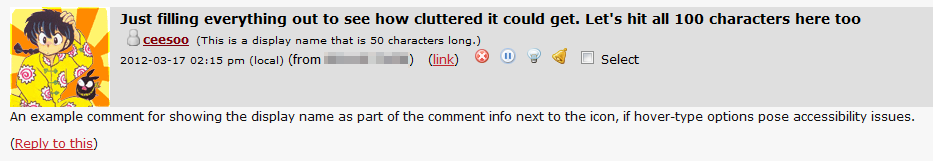
I'm not sure what it'd look like with everything filled in (I don't have access to an image editor atm), but it does seem less cluttered to me.
Re: 5
The second one makes comments look ugly but usernames are easier to spot imo and display names easier to visually filter out if it's not information you're interested in or info you already know.
blah blah blah blah blah blah blah blah blah blah blah blah blah blah blah blah blah blah blah blah
Now that I'm home and can actually use an image editor now, I'll see if I can mock up a version of how it'd look without any other alterations.
Hence the random long subject line I've just put inRe: blah blah blah blah blah blah blah blah blah blah blah blah blah blah blah blah blah blah blah b
By default, no. I use a 15px minimum font size in Firefox because I can't read text comfortably otherwise. I don't know which font size or zoomed out level people with visual issues use but it's something to take into account, imo.
Edit: also font size in Troposhperical is noticeably smaller than in other skins. That's gonna change so one should see how it looks like in other skins as well (not saying there's a difference; I don't know as I've never used them).
Re: blah blah blah blah blah blah blah blah blah blah blah blah blah blah blah blah blah blah blah b
Anyhow, here's the version I just did up (I moved the display name over, since it seems to me that it'd make sense for it to be aligned with the username. I've got two version here too, one with it aligned to the username icon and one with it aligned to the username text):
The icons do sit a bit funny. I think that's because they're larger than the size of the text for the date and time.
Re: blah blah blah blah blah blah blah blah blah blah blah blah blah blah blah blah blah blah blah b
Re: blah blah blah blah blah blah blah blah blah blah blah blah blah blah blah blah blah blah blah b
Re: blah blah blah blah blah blah blah blah blah blah blah blah blah blah blah blah blah blah blah b
Celerity:
Gradiation:
Lynx:
Celerity has the most issues with crowding. Also, it occurs to me that a potential issue here is how the "Comment successfully posted" message will appear, since in Celerity especially, this would cause the space where that normally goes to not be available anymore.
no subject
2 + 7, and a side of 6, please!
7: I like that too! Low-impact, but it's there, and it doesn't clutter stuff up. Plus, even mobile users can access this part. 2 + 7 together seem like a fantastic choice to me.
6: I like the option. I don't know how successful I'll be yet, but I'm tinkering with layout stuff right now. Hopefully something worthwhile will come of this. :)
Re: 2 + 7, and a side of 6, please!
And even if display names are included across the site, I think it'd definitely be valuable to actually have some styles that make comment pages more useable.
Re: 2 + 7, and a side of 6, please!
6: Working on reformatting the comments' output right now, to emulate the site default comments. So far, I've managed to confuse myself, figure out where I was again, then get lost once more. But my toes are in the water so to speak, so it's something, I guess? My focus is on doing an RP-helpful layout, so input is totally welcome. I see you're an RPer yourself...? :)
Re: 2 + 7, and a side of 6, please!
Oh god, it sounds confusing! (I've never even managed to figure out how to code any layout at all, let alone anything complicated). And yes, I am an RPer! And the main consideration with rping and styles is that they need to be able to handle really long and massive threads. One thing that helps with this is having the full (or at least more of) the width of the page. When you've got more width to the page, it means that comments won't collapse so soon (or start warping into some weird ridiculously thin rectangle, which is what usually happens in styles). It's also just plain easier to read tags.
Also, a lot of this was actually hashed out a lot on LJ, back when their new comment pages were brought in. There was a big rush to code layouts that could actually work for rping purposes. So, they'd be a good thing to look at (even if only to see what people are talking about what they need in the comments - there was a lot of discussion that went into it). The code that was made up is here. Design wise, the biggest issue with that one is that you effectively lose your layout, because all of the things like sidebars and whatnot had to be coded out to get the functionality. They also had to work from the base of of a specific style (Minimalism), because that was one of the base styles that would actually have comments collapse properly instead of stretching, I think.
Re: 2 + 7, and a side of 6, please!
But I think this might be derailing the conversation about display names here a bit much, so how about I drop this link here, and we take the talks there? :) I'd really appreciate getting to talk to more RPers about this!
Re: 2 + 7, and a side of 6, please!
Hah, we are derailing a bit aren't we? (Although if the display name ended up being something that was only available in styles, it would be relevant.) I'll head over to the link!
2 - when you have access/subscription to a user
access
username and you have mutual
subscriptions
Send message
Remove access
Remove subscription
Ban user
View: Journal | Profile
SO, if that #2 is implemented, whoever was adding in the display name would also have to fiddle around to make it more readable. Say, something like this:
1)
This is a display name that is 50 characters long.
mutual access [ON]
mutual subscription [ON]
Send message
Remove access
Remove subscription
Ban user
View: Journal | Profile
OR
2)
This is a display name that is 50 characters long.
Send message
Mutual Access [Remove]
Mutual Subscription [Remove]
Ban user
View: Journal | Profile
Or something to that effect.
Re: 2 - when you have access/subscription to a user
has given you access
has subscribed to you
or
you gave access
you have subscribed
Re: 2 - when you have access/subscription to a user
mutual subscription
(the ON isn't really necessary in this case)
Re: 2 - when you have access/subscription to a user
Access Granted To [Remove]
Subscribed To [Remove]
Access Granted From [Add]
Subscription From [Add]
Re: 2 - when you have access/subscription to a user
Access Granted To [Remove]
You Subscribed To [Remove]
Given Access From [Add]
Subscribed To You [Add]
Re: 2 - when you have access/subscription to a user
This is a display name that is 50 characters long.
Send message
Mutual Access [Remove]
Mutual Subscription [Remove]
View: Journal | Profile
Ban user
THE BAN USER LINK would preferably be aligned to the bottom right corner on the same line as the View: Journal | Profile line to keep it out of the way...