Denise (![[staff profile]](https://www.dreamwidth.org/img/silk/identity/user_staff.png) denise) wrote in
denise) wrote in ![[site community profile]](https://www.dreamwidth.org/img/comm_staff.png) dw_suggestions2010-01-05 09:26 am
dw_suggestions2010-01-05 09:26 am
Entry tags:
Why more options are generally bad UI
One of the most frequent things I see in dw_suggestions is a pattern that goes like this:
User A, making the suggestion: I don't like this behavior foo, and I think it should do bar instead.
User B: I rely on this behavior foo, and if it did bar, it would break my use of the site.
User A: Okay, so, I'd like to refine my suggestion to instead propose an option so people who want foo can have foo, and people who want bar can have bar.
(Or, the compact version: user A, knowing that their friends use foo but they want bar, proposes a suggestion that jumps straight to the option.)
Those suggestions are less likely to get accepted for implementation. Very, very, very much less likely to get accepted for implementation. Why? From a user interface design standpoint, generally speaking, options are bad. They force someone to make a choice, and nine times out of ten, those choices aren't necessary.
Generally speaking, people like to feel like they've customized their environment to their own tastes -- but, conversely speaking, people also feel uncomfortable and awkward when they're offered a choice they don't understand or can't "intuitively" figure out.
Now, for the purposes of web usability -- hell, for the purpose of computer usability, period -- "intuitively figuring something out" is defined as "it does what I think it should do, based on my collected history of experience with computers". This generally means, "it follows the usage model that I'm familiar with" -- which means, in most cases, "it works the way the market leader works", since that's what people are likely to be most familiar with.
A new user, confronted with a panel of options, won't read the explanatory text or the FAQ or the carefully-crafted description of each option. They'll look at the options and decide that this software is too complex and too hard to use, and they'll go back to using what they're familiar with.
As an example, let's take a look at the Preferences panel of Scrivener. Now, don't get me wrong: Scrivener is, hands down, the best word processor available for anyone who has to do writing, research-wrangling, or anything involving creative work. I love this program. I adore this program. I am writing this entry in this program right now.
If I accidentally lose my preferences on this program, or if I'm setting it up on a new machine and don't have my preferences file at hand, it takes me forty-five minutes to rebuild them. Why?
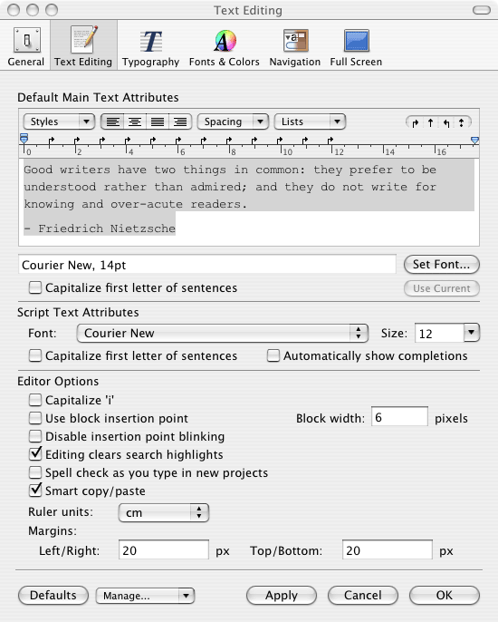
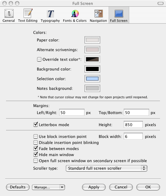
Here's the preferences tab you see when you open the program's preferences:

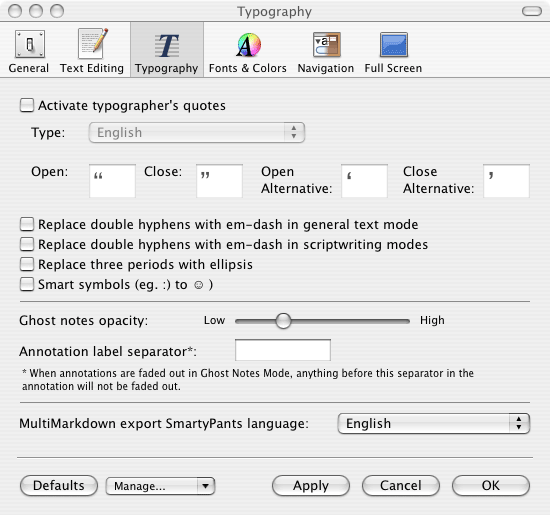
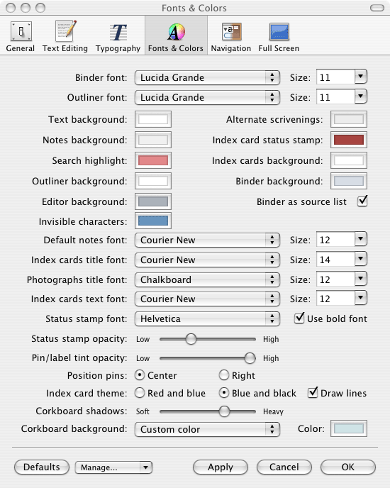
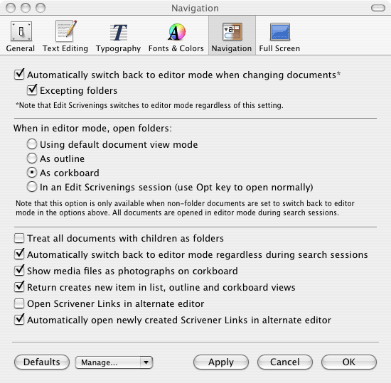
Now, mind you, that's just one pane. There's also the text editing pane. And the typography pane. And the fonts & color pane. And the navigation pane. And the full screen pane. (Which does not put the program into full screen mode, of course -- it merely governs what happens when the program is *in* full screen mode.)
Don't get me wrong. I love Scrivener. I love it to death. It's the best program for managing creative output on the market, and at least half of that is because of the various options. Writers are cranky, cantankerous creatures -- I know because I am one -- who will endlessly fuss with their work environment until this window is precisely pixel-centered, and that window is just the right shade of blue, and claim that they're unable to work if they can't get it to look exactly the way they need it to work. (I have been known to engage in more than a little bit of this redecorationism myself. Let us not ask about what I needed to do before I could get started on this essay.)
Scrivener's smart about their eight gajillion options: it allows you to save and load preferences files, so you can transfer them from computer to computer, recognizing that it's a lot to ask people to set each and every one of their preferences. People still take one look at the preferences pane, throw up their hands, close the pane, and accept the defaults. And if you don't lose them as users then and there, it will take them months, if not years, to figure out all the things your program can do. (True story: While taking those screenshots, I figured out at least three options that I've been wishing Scrivener had. It did. I just couldn't find them. And I am, let us say, a less-than-typical user. If I can't find them, my father has absolutely zero chance of finding them.)
You guys have seen Warmouse's OOMouse that was just announced, right? With the 18 different mouse buttons, most of which are smaller than the average adult human being's fingers? Contrast that to Apple's mouse, which has no mouse buttons: it uses touch-sensitive technology to figure out where you're clicking and what you want to do with it. Which one of those products intuitively looks more usable?
The response from most of the tech world has been laughter, but it's a real symptom of a major problem with open-source software: the "all things to all people" approach, where instead of making decisions to prioritize one option or the other, the project maintainer chooses both:
(That's from a fairly scathing condemnation of Open Source usability: The Usability of Open Source Software by David Nichols and Michael Twidale.)
The people who are most likely to be open-source developers -- and, to some extent, the people who make suggestions about something an open source project should implement -- are the expert users. Their idea of how an application should behave is entirely different than J. Average User.
The traditional hallmark of J. Average Userdom is often heard as the "mom test", the "grandma test", or the "girlfriend test" -- if you gave this software to your $person, how well could they use it -- which I dislike the phrasing of because of the inherent sexism while at the same time liking the motivation behind it. Personally, as I mentioned a few minutes ago, I use my father as the watermark. He can't find anything if it isn't saved to the desktop and needs written instructions (that he keeps next to the computer) to perform any task more than twice. He's a brilliant man, mind you. His mind just doesn't work in the same metaphors that software developers consider a matter of course. So, when he sits down to the computer, he looks at the 18 mouse buttons, or at the hundred-and-fifty-something different preferences, and he gets annoyed: why are you asking me about this stuff? I'm just trying to write a letter.
Now, I'm not saying that all options are bad. For one, options are generally hallmarks of features, and features are generally good things. There's a generally-accepted truism in the software world that 80% of your users will only use 20% of your features, but there's a corresponding truism that each person will use a different 20% of your features. You can't just cut out the other 80% of features and skate by, because everyone's usage pattern is different.
Correspondingly, there will always need to be some options. Let's say you've identified two major use cases for your software, equally divided: 50% of your users are Case A, and 50% of your users are Case B. You're about to release a feature that will make life 100% easier for Case A, but seriously impede Case B. It'd only be smart to allow Case B users to choose not to use that feature. In most cases, the answer will be "well, if it makes your use of the software harder, don't use that feature", but in some cases, in order to implement the feature, you need to change some of the core ways your software behaves. In that situation, it's logical to offer an option to turn the feature off: if you don't, you might be picking up probably about 20% more users in Case A (because of the 80%/20% rule) who are attracted by the feature, but you'll be losing the 50% of users in Case B who suddenly can't use your software to accomplish what they've been using it for.
(This is a dramatic example. Real life examples of software design are a lot harder and a lot more subtle.)
But you also have to take into account the users who will take one look at your product and wander away because they think it's too hard to use. These people are nearly impossible to measure, because they don't show on any stats or metrics. (On Dreamwidth, we can measure them a little, by how many people have accounts that haven't been active in the last 30 days, but that's not the best metric, because there's no way of knowing the reason they haven't been active, and there's no way of counting the people who never created an account in the first place.)
So, options are a tradeoff. Every time you add one, you're asking the user to make a choice, and you the software designer are promising them, implicitly -- by the very fact that you are offering them a choice -- that this particular choice is important. It's major. It's something they should care about, because you care about it, enough to tell them that they should have a reason to pick one or the other. If you didn't care about it, you'd just pick a default and set it for them, right?
This means that if you're going to give the user a choice, it needs to be important enough to justify that choice.
To cycle back to the beginning of this, the discussion aboutdw_suggestions, what sort of "add an option" suggestions are likely to get through to the point of being implemented?
At this point, and until we can get our options tabs redesigned and cleaned up -- which is an ongoing project of mine -- probably few to none. The biggest ones we're likely to add are things that have a very good argument-in-favor that rely on one of two things: things that improve privacy or things that improve accessibility.
One thing we haven't done a lot of, but that I'm way less opposed to (and Mark is even more anti-options than I am, but he's also more okay with this) are things that remember the last-used-value. For instance, one of the common things we hear suggestions for: "let me pick what should be the default in the search bar drop-down". (Should it be Site & Account? Should it be Interest? Should it be 'this journal', when we add it? etc.) That's such a minor thing that we'd likely never add an option for it. But remembering the last used value, so that if you always use it to search for Site & Account and never Interest, you only have to change it once? That's a small touch that improves usability for people whose usage pattern doesn't match the majority, while not disturbing those whose usage pattern is the majority and not adding another option to look scary to people. (And it's something we'll be adding as soon as I figure out how to do it!)
So, if you're looking to suggest a new option to do something, stop and ask yourself two things:
1). Is this option something that a majority of users care about?
2). Is this an itch that can be scratched with a different solution that doesn't involve adding an option?
If the answers are, respectively, 'yes' and 'no', then go ahead and suggest it. If not, start brainstorming about what those different solutions might be.
If all else fails, post a suggestion identifying the problem and saying that you don't think this is enough to warrant a new option, but you'd like to start some brainstorming on what other solutions we might come up with. We've got a lot of very smart people who can come up with different solutions once a need has been established, and Mark and I are both perfectly fine with usingdw_suggestions to conduct that brainstorming.
User A, making the suggestion: I don't like this behavior foo, and I think it should do bar instead.
User B: I rely on this behavior foo, and if it did bar, it would break my use of the site.
User A: Okay, so, I'd like to refine my suggestion to instead propose an option so people who want foo can have foo, and people who want bar can have bar.
(Or, the compact version: user A, knowing that their friends use foo but they want bar, proposes a suggestion that jumps straight to the option.)
Those suggestions are less likely to get accepted for implementation. Very, very, very much less likely to get accepted for implementation. Why? From a user interface design standpoint, generally speaking, options are bad. They force someone to make a choice, and nine times out of ten, those choices aren't necessary.
Generally speaking, people like to feel like they've customized their environment to their own tastes -- but, conversely speaking, people also feel uncomfortable and awkward when they're offered a choice they don't understand or can't "intuitively" figure out.
Now, for the purposes of web usability -- hell, for the purpose of computer usability, period -- "intuitively figuring something out" is defined as "it does what I think it should do, based on my collected history of experience with computers". This generally means, "it follows the usage model that I'm familiar with" -- which means, in most cases, "it works the way the market leader works", since that's what people are likely to be most familiar with.
A new user, confronted with a panel of options, won't read the explanatory text or the FAQ or the carefully-crafted description of each option. They'll look at the options and decide that this software is too complex and too hard to use, and they'll go back to using what they're familiar with.
Too many preferences make people choose no preferences at all.
As an example, let's take a look at the Preferences panel of Scrivener. Now, don't get me wrong: Scrivener is, hands down, the best word processor available for anyone who has to do writing, research-wrangling, or anything involving creative work. I love this program. I adore this program. I am writing this entry in this program right now.
If I accidentally lose my preferences on this program, or if I'm setting it up on a new machine and don't have my preferences file at hand, it takes me forty-five minutes to rebuild them. Why?
Here's the preferences tab you see when you open the program's preferences:
Now, mind you, that's just one pane. There's also the text editing pane. And the typography pane. And the fonts & color pane. And the navigation pane. And the full screen pane. (Which does not put the program into full screen mode, of course -- it merely governs what happens when the program is *in* full screen mode.)
Don't get me wrong. I love Scrivener. I love it to death. It's the best program for managing creative output on the market, and at least half of that is because of the various options. Writers are cranky, cantankerous creatures -- I know because I am one -- who will endlessly fuss with their work environment until this window is precisely pixel-centered, and that window is just the right shade of blue, and claim that they're unable to work if they can't get it to look exactly the way they need it to work. (I have been known to engage in more than a little bit of this redecorationism myself. Let us not ask about what I needed to do before I could get started on this essay.)
Scrivener's smart about their eight gajillion options: it allows you to save and load preferences files, so you can transfer them from computer to computer, recognizing that it's a lot to ask people to set each and every one of their preferences. People still take one look at the preferences pane, throw up their hands, close the pane, and accept the defaults. And if you don't lose them as users then and there, it will take them months, if not years, to figure out all the things your program can do. (True story: While taking those screenshots, I figured out at least three options that I've been wishing Scrivener had. It did. I just couldn't find them. And I am, let us say, a less-than-typical user. If I can't find them, my father has absolutely zero chance of finding them.)
Open Source software has a horrible reptuation for usability.
You guys have seen Warmouse's OOMouse that was just announced, right? With the 18 different mouse buttons, most of which are smaller than the average adult human being's fingers? Contrast that to Apple's mouse, which has no mouse buttons: it uses touch-sensitive technology to figure out where you're clicking and what you want to do with it. Which one of those products intuitively looks more usable?
The response from most of the tech world has been laughter, but it's a real symptom of a major problem with open-source software: the "all things to all people" approach, where instead of making decisions to prioritize one option or the other, the project maintainer chooses both:
Worse, given that peer esteem is a crucial incentive for participation, deletion of functionality in the interest of benefiting the end user creates a strong disincentive to future participation, perhaps considered worse than having one's code replaced by code that one's peers have deemed superior. The project maintainer, in order to keep volunteer participants happy, is likely to keep functionality even if it is confusing, and on receipt of two similar additional functionalities, keep both, creating options for the user of the software to configure the application to use the one that best fits their needs.
[...]
We speculate that freedom of choice may be considered a desirable attribute (even a design aesthetic) by many OSS developers. The end result is an application that has many configuration options, allowing very sophisticated tailoring by expert users, but which can be bewildering to a novice.
(That's from a fairly scathing condemnation of Open Source usability: The Usability of Open Source Software by David Nichols and Michael Twidale.)
The people who are most likely to be open-source developers -- and, to some extent, the people who make suggestions about something an open source project should implement -- are the expert users. Their idea of how an application should behave is entirely different than J. Average User.
The traditional hallmark of J. Average Userdom is often heard as the "mom test", the "grandma test", or the "girlfriend test" -- if you gave this software to your $person, how well could they use it -- which I dislike the phrasing of because of the inherent sexism while at the same time liking the motivation behind it. Personally, as I mentioned a few minutes ago, I use my father as the watermark. He can't find anything if it isn't saved to the desktop and needs written instructions (that he keeps next to the computer) to perform any task more than twice. He's a brilliant man, mind you. His mind just doesn't work in the same metaphors that software developers consider a matter of course. So, when he sits down to the computer, he looks at the 18 mouse buttons, or at the hundred-and-fifty-something different preferences, and he gets annoyed: why are you asking me about this stuff? I'm just trying to write a letter.
You have to balance features/options with usability.
Now, I'm not saying that all options are bad. For one, options are generally hallmarks of features, and features are generally good things. There's a generally-accepted truism in the software world that 80% of your users will only use 20% of your features, but there's a corresponding truism that each person will use a different 20% of your features. You can't just cut out the other 80% of features and skate by, because everyone's usage pattern is different.
Correspondingly, there will always need to be some options. Let's say you've identified two major use cases for your software, equally divided: 50% of your users are Case A, and 50% of your users are Case B. You're about to release a feature that will make life 100% easier for Case A, but seriously impede Case B. It'd only be smart to allow Case B users to choose not to use that feature. In most cases, the answer will be "well, if it makes your use of the software harder, don't use that feature", but in some cases, in order to implement the feature, you need to change some of the core ways your software behaves. In that situation, it's logical to offer an option to turn the feature off: if you don't, you might be picking up probably about 20% more users in Case A (because of the 80%/20% rule) who are attracted by the feature, but you'll be losing the 50% of users in Case B who suddenly can't use your software to accomplish what they've been using it for.
(This is a dramatic example. Real life examples of software design are a lot harder and a lot more subtle.)
But you also have to take into account the users who will take one look at your product and wander away because they think it's too hard to use. These people are nearly impossible to measure, because they don't show on any stats or metrics. (On Dreamwidth, we can measure them a little, by how many people have accounts that haven't been active in the last 30 days, but that's not the best metric, because there's no way of knowing the reason they haven't been active, and there's no way of counting the people who never created an account in the first place.)
So, options are a tradeoff. Every time you add one, you're asking the user to make a choice, and you the software designer are promising them, implicitly -- by the very fact that you are offering them a choice -- that this particular choice is important. It's major. It's something they should care about, because you care about it, enough to tell them that they should have a reason to pick one or the other. If you didn't care about it, you'd just pick a default and set it for them, right?
This means that if you're going to give the user a choice, it needs to be important enough to justify that choice.
So, what do we-here-at-Dreamwidth consider important enough to justify adding options?
To cycle back to the beginning of this, the discussion about
At this point, and until we can get our options tabs redesigned and cleaned up -- which is an ongoing project of mine -- probably few to none. The biggest ones we're likely to add are things that have a very good argument-in-favor that rely on one of two things: things that improve privacy or things that improve accessibility.
One thing we haven't done a lot of, but that I'm way less opposed to (and Mark is even more anti-options than I am, but he's also more okay with this) are things that remember the last-used-value. For instance, one of the common things we hear suggestions for: "let me pick what should be the default in the search bar drop-down". (Should it be Site & Account? Should it be Interest? Should it be 'this journal', when we add it? etc.) That's such a minor thing that we'd likely never add an option for it. But remembering the last used value, so that if you always use it to search for Site & Account and never Interest, you only have to change it once? That's a small touch that improves usability for people whose usage pattern doesn't match the majority, while not disturbing those whose usage pattern is the majority and not adding another option to look scary to people. (And it's something we'll be adding as soon as I figure out how to do it!)
So, if you're looking to suggest a new option to do something, stop and ask yourself two things:
1). Is this option something that a majority of users care about?
2). Is this an itch that can be scratched with a different solution that doesn't involve adding an option?
If the answers are, respectively, 'yes' and 'no', then go ahead and suggest it. If not, start brainstorming about what those different solutions might be.
If all else fails, post a suggestion identifying the problem and saying that you don't think this is enough to warrant a new option, but you'd like to start some brainstorming on what other solutions we might come up with. We've got a lot of very smart people who can come up with different solutions once a need has been established, and Mark and I are both perfectly fine with using
no subject
That said, if it's a case of introducing a feature, I think it makes most sense for the "option" to be simply not to use the feature if you don't like it. Features that are not core to using the site shouldn't be forced on users, either because the pathway is set up so you can't avoid them, or because there are CProds and other intrusive, repeated reminders about new features you haven't tried yet. This makes things much better for both the users who like everything just so, and those who prefer a streamlined UI.
I have no interest at all in using a GUI editor for HTML, I'd much much much rather hand-code (see under: atypical user!) But I have no problem with that option existing on the site, I just choose not to use it. But I do have a problem with, say, an update page that relies heavily on JavaScript and doesn't work in old or text-only browsers. The current system, where it just remembers your last choice, is probably preferable to having a ticky box with an incomprehensible title in a tab I can't find, but IMO the ticky box would be infinitely preferable to forcing everybody to use the RTE.
The other reason I don't completely buy this philosophy is that some minority users are not merely more fussy than average, but working round limitations, either technological or personal / medical, in the way they use DW. In many cases, options are an accessibility issue, not just a trying to please a wide range of fussy users issue. Since I really admire DW's deep commitment to accessibility, I hope it will be applied to this question as well.